Cesar Torres
Portfolio
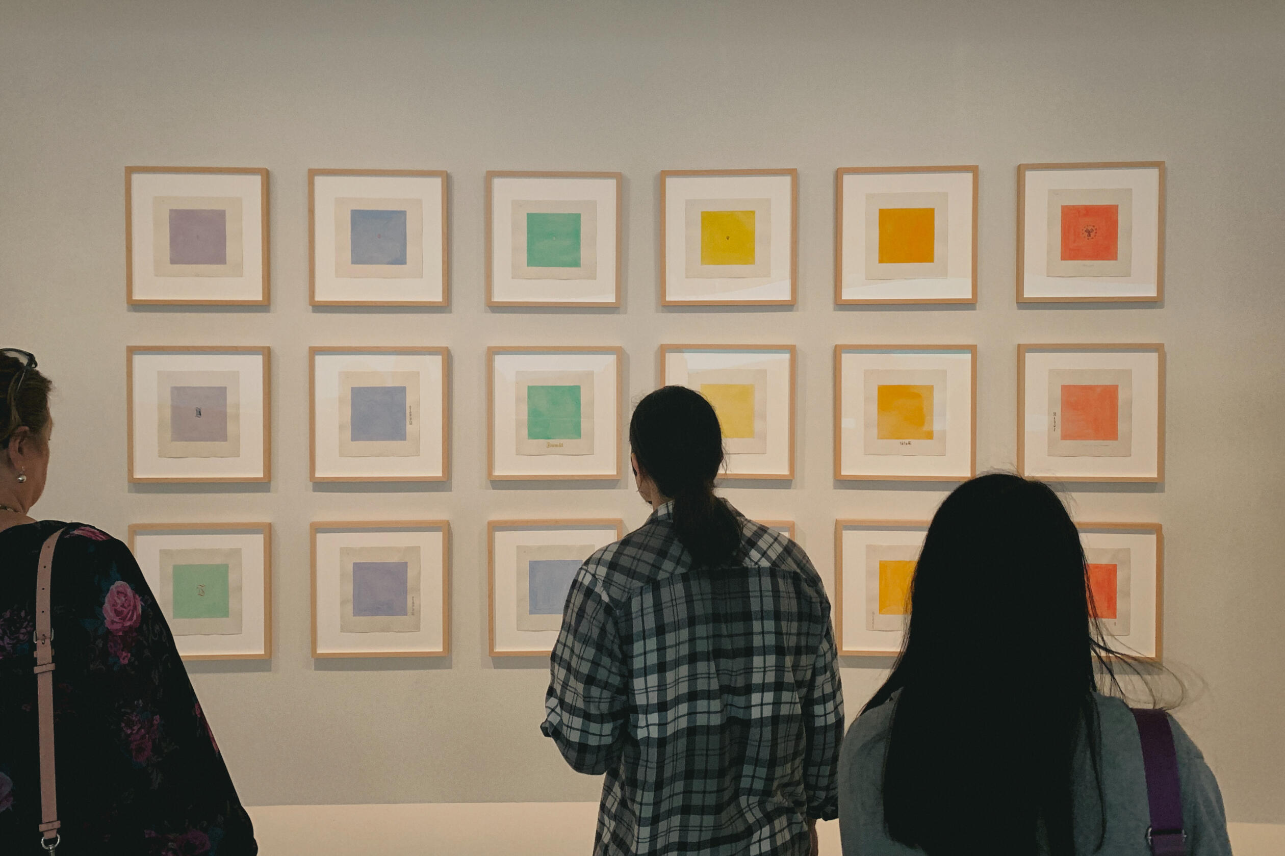
Below is an incomplete collection of work on which I've had the opportunity to collaborate.
🪄 Design × AI
Getting Hands-On
I've been building hands-on fluency with AI-assisted design and development workflows — exploring how the design-to-implementation gap is closing in real time.My current stack has landed somewhere unexpected: visual design and code, centralized inside an IDE.* It feels like being 15 again, learning to code websites — except the tools are doing things I couldn't even imagine back then.
↪ Also, one fun fact, I like to represent "AI" as 🪄 instead of ✨ — it's a small, very pedantic detail, but I like that it signals a human is still directing the generative AI. 🙃
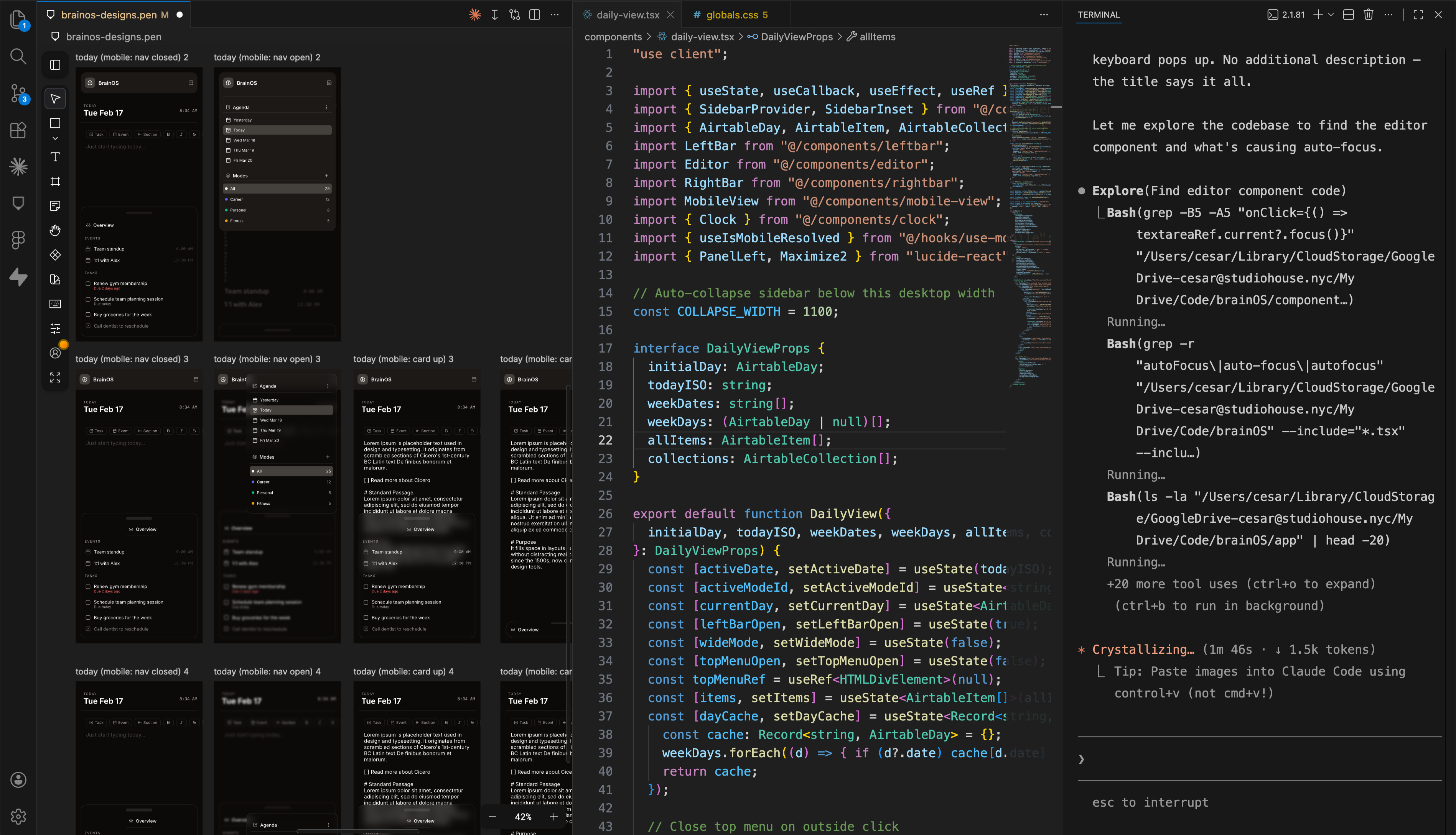
*My setup today: Visual Studio Code with the Claude Code terminal interface (far R) and design and layout integrated via the Pencil extension (far L). Figma who? 👀
Stensul
March 2025 - March 2026
Most recently, I was the Director of Product Design at Stensul — a no-code campaign creation platform for enterprise marketing teams — where I led an international design, research, and UX engineering team from NYC.
✶ Work coming soon

Brex
January 2022 - January 2024
After a contract for a small-business focused MVP, the fintech company Brex acquired Studiohouse — I joined full-time as design lead to help the product GTM and grow. When the company's revenue and product strategies shifted upmarket, I set the product vision and experience for these new, high value customers as Group Design Lead for Credit/Underwriting.
Studiohouse
August 2017 - March 2022
Studiohouse was a design studio based in New York City that I co-founded with Cullen Wilson. As Partner + Creative Director, I was design lead on the studio's product and web design projects and creative director on any brand identity work. After nearly five years in operation, Brex acquired the studio and we joined their Design team full-time.
✶ See partner work below
Clients

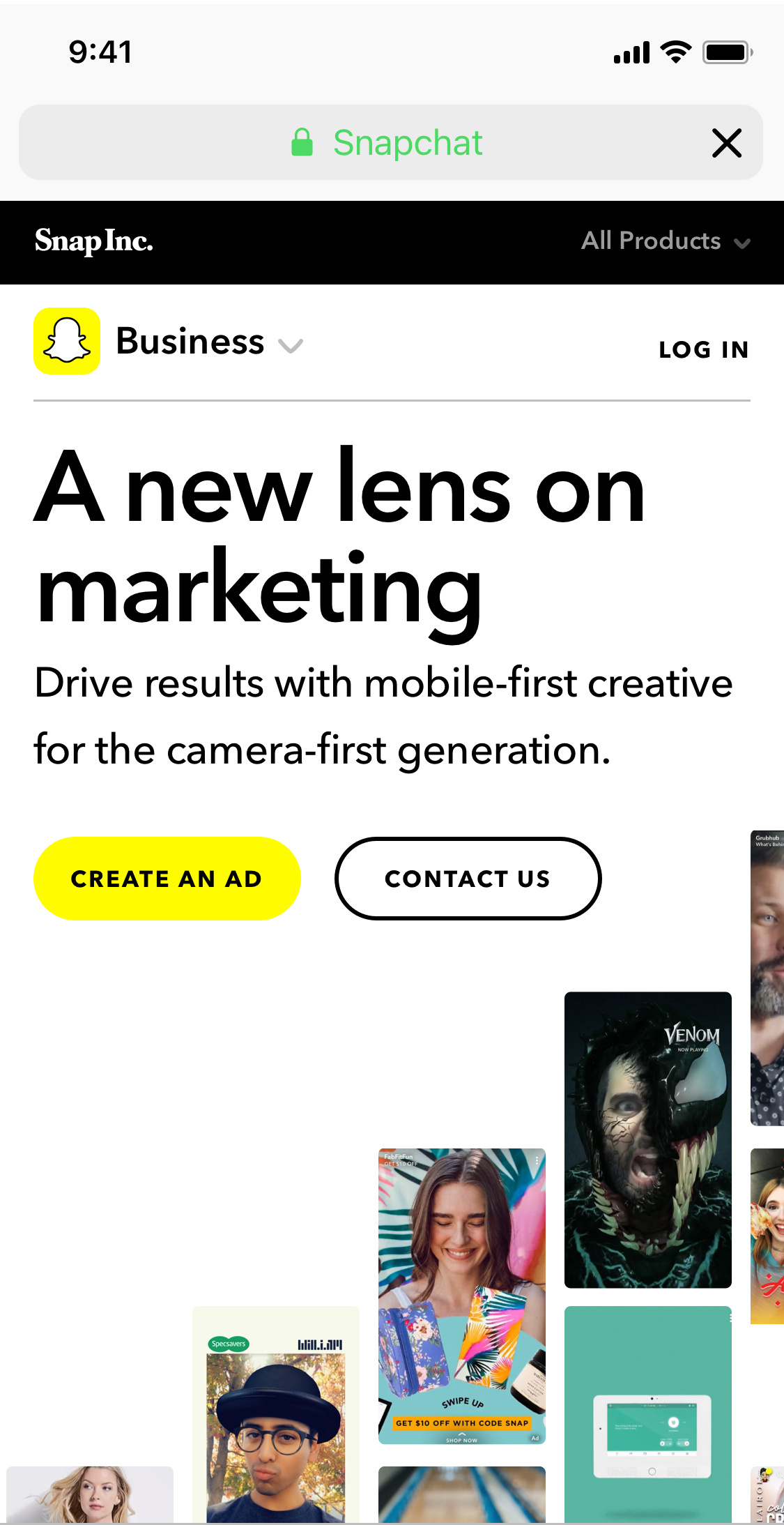
Snap Inc.
Studiohouse was on the shortlist of "agencies of record" for Snap. I led the projects we collaborated on with various product, technical, and corporate teams.
Glossier
Glossier hired Studiohouse to redesign the company's e-commerce site, which had not been updated since the company's start in 2014.


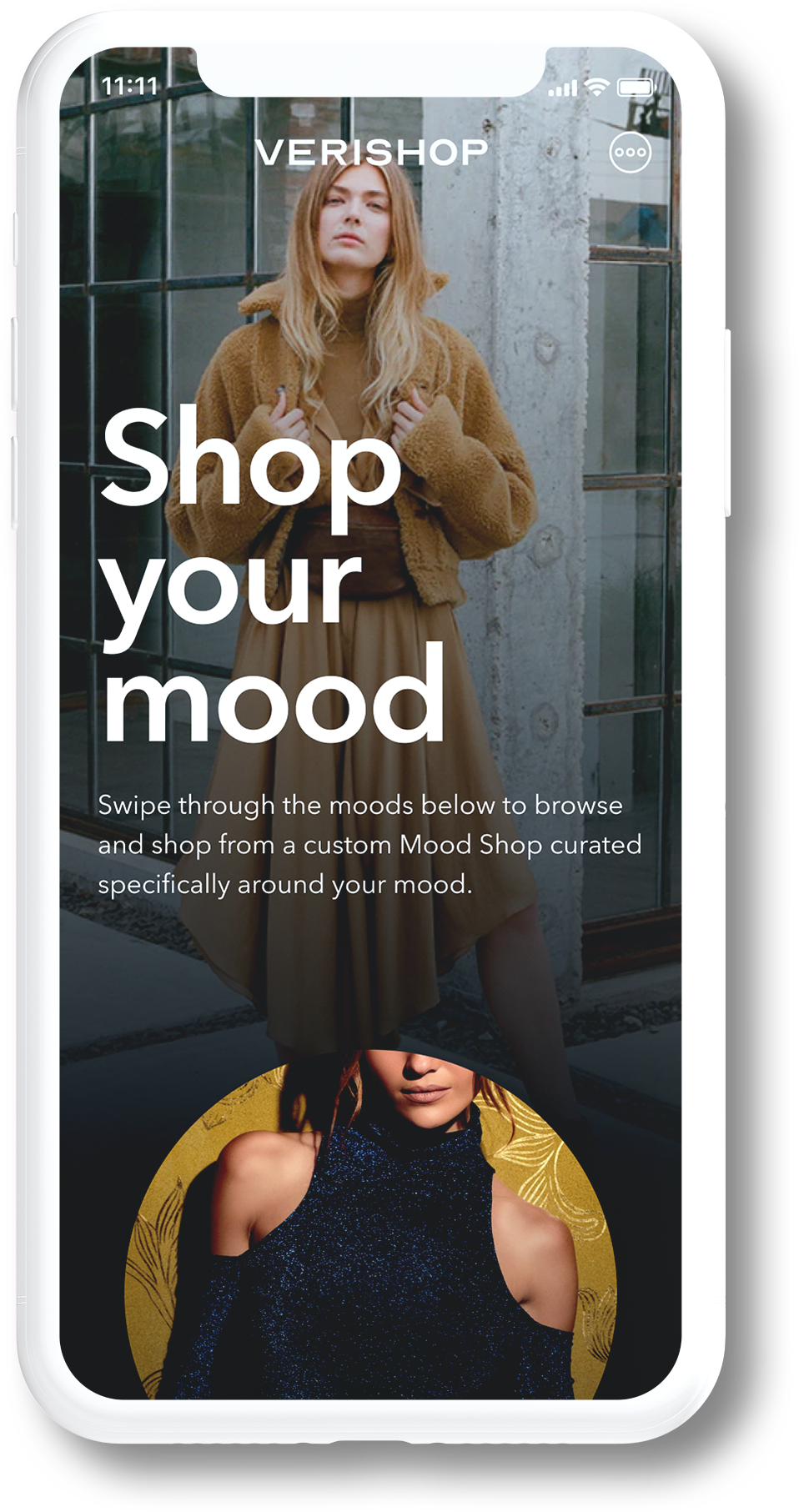
Verishop
Studiohouse partnered with the Verishop Head of Design, Jessica Anerella, to provide the product strategy and product design of an experimental shopping experience.
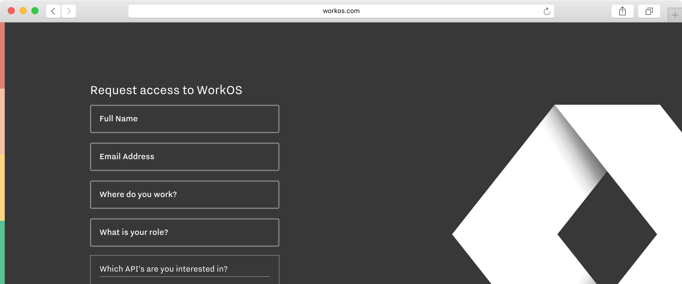
WorkOS
We partnered with WorkOS founder Michael Gingrich on a brand strategy and visual identity for a new enterprise software platform he was starting.


General Motors
January 2016 - September 2016
I joined General Motors as Chief Creative to oversee the "urban mobility" product design and UX teams across SF, Austin, and Detroit. Additionally, I served as internal council for new and ongoing mobility programs within the mobility division.

Sidecar
May 2013 – January 2016
Sidecar was a transportation company based in San Francisco that provided ridesharing and delivery services. As the sole design leader and Head of Design, I built the multi-disciplinary design team of four and owned all of the company's design properties across product and brand. General Motors acquired the company, including a team of 20 employees.
Thanks! ✌️
Thanks for taking a look through my past work — please let me know if you need more detail or have any questions!
Brex
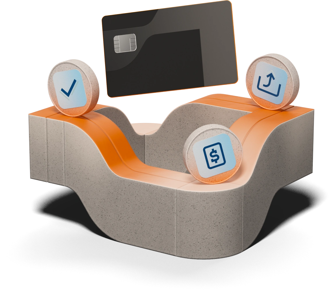
Corporate cards, from startup to enterprise.
I joined the Brex New Verticals team as design lead for a "Buy now, pay later" card. Later, I drove the Credit/Underwriting enterprise product experience and product vision as Global Limits group design lead.
✶ Projects included:
Buy Now, Pay Later
An e-commerce business credit card.
Product design ・ XFN operations ・ GTM strategy
In H2 2021, the Brex New Verticals product team had been nearing the end of a successful product pilot. The program explored the viability and requirements for a new credit card for e-commerce small businesses.
Business goal: Provide a credit policy and product experience to an underserved and profitable customer type.
Design problem: Evolve a pilot into a product experience centered around the financial rhythms of e-commerce small businesses.
Outcome: Changing company priorities led to the product's end just one month before launch.
My scope: I was the sole design lead, responsible for all product design.
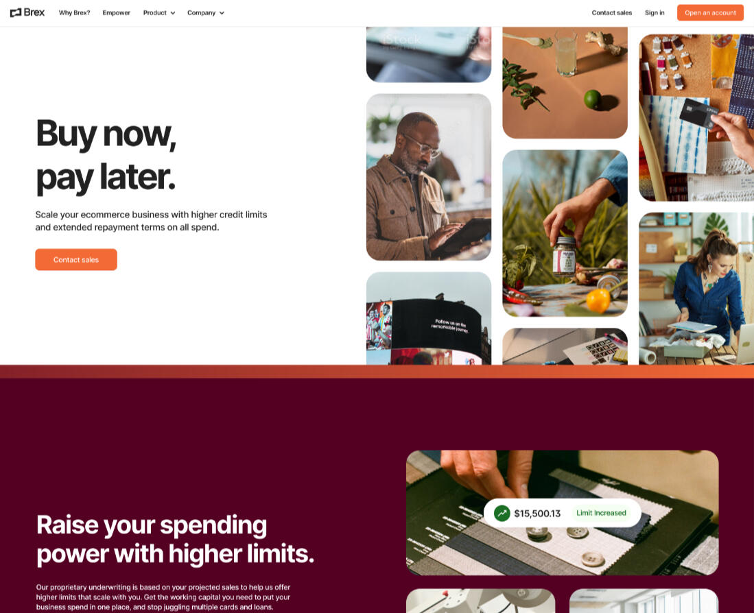
* To maintain company and product privacy, illustrative visuals are presented below.
Illustrative BNPL dashboard concept


Sketches and diagrams for documenting layout and flows
MVP → MLP
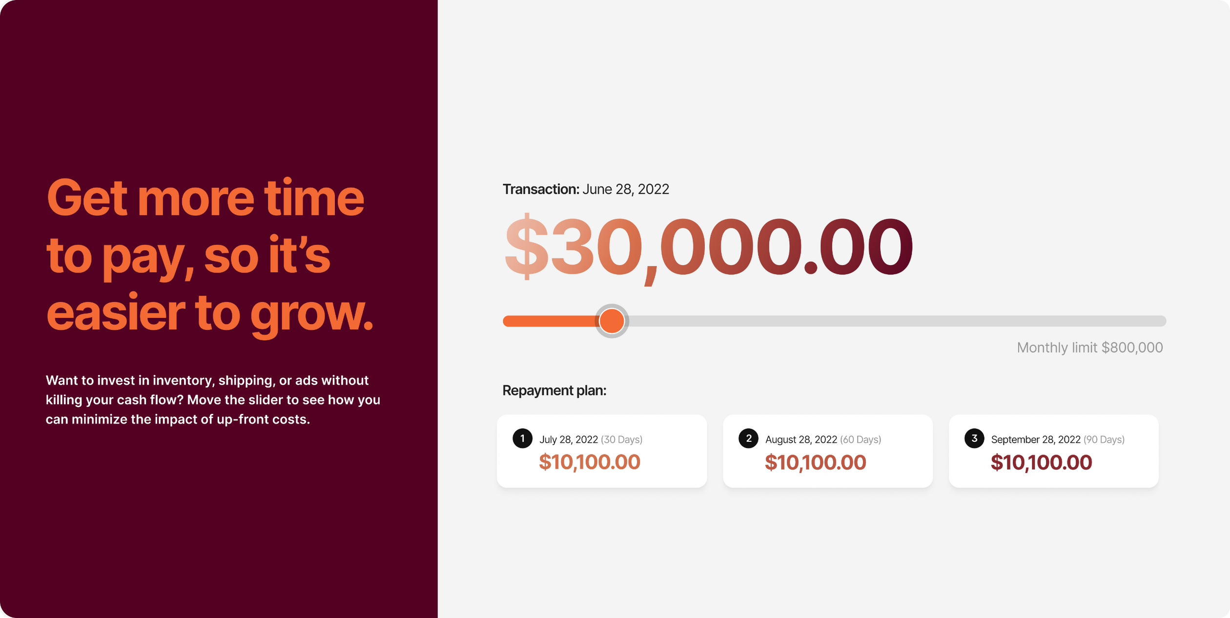
A "buy now, pay later" (BNPL) card experience sought to address the specific financial rhythms of this demographic: large upfront inventory purchases and cyclical yearly economic patterns. In addition to the core Brex card and dashboard product experience, the product would allow Individual purchases to be paid back in three installments due 30/60/90 days from the initial transaction.As 2022 kicked off, the team sought to quickly stand up a workable first version of the product in support of the months long manual pilot. The Studiohouse contract scope comprised of delivery of a minimum lovable product (MLP) to be completed over a six-week product design sprint.
I dove right in and evaluated the existing product experience and design system for a baseline from which to build from. One key design principle I called out to the team early on was to make sure we were addressing the specific demographic’s needs but weren’t creating too far of a deviation from the core Brex product experience, thereby impacting areas like the main codebase, design system, and Support knowledge and documentation.I reviewed the requirements that my Product partner had put together in advance of the studio coming on board. He also shared with me a roundup of customer calls he had used to inform his requirements. After feedback rounds and PRD edits, we finalized the cut line for the MLP.
"I feel very lucky to have had the opportunity to work with Cesar as my design partner… All-in, acquiring Studiohouse and bringing Cesar aboard was one of Brex's strongest people decisions, and I'm excited to see Cesar grow into a design leader at Brex."
–New Verticals PM lead


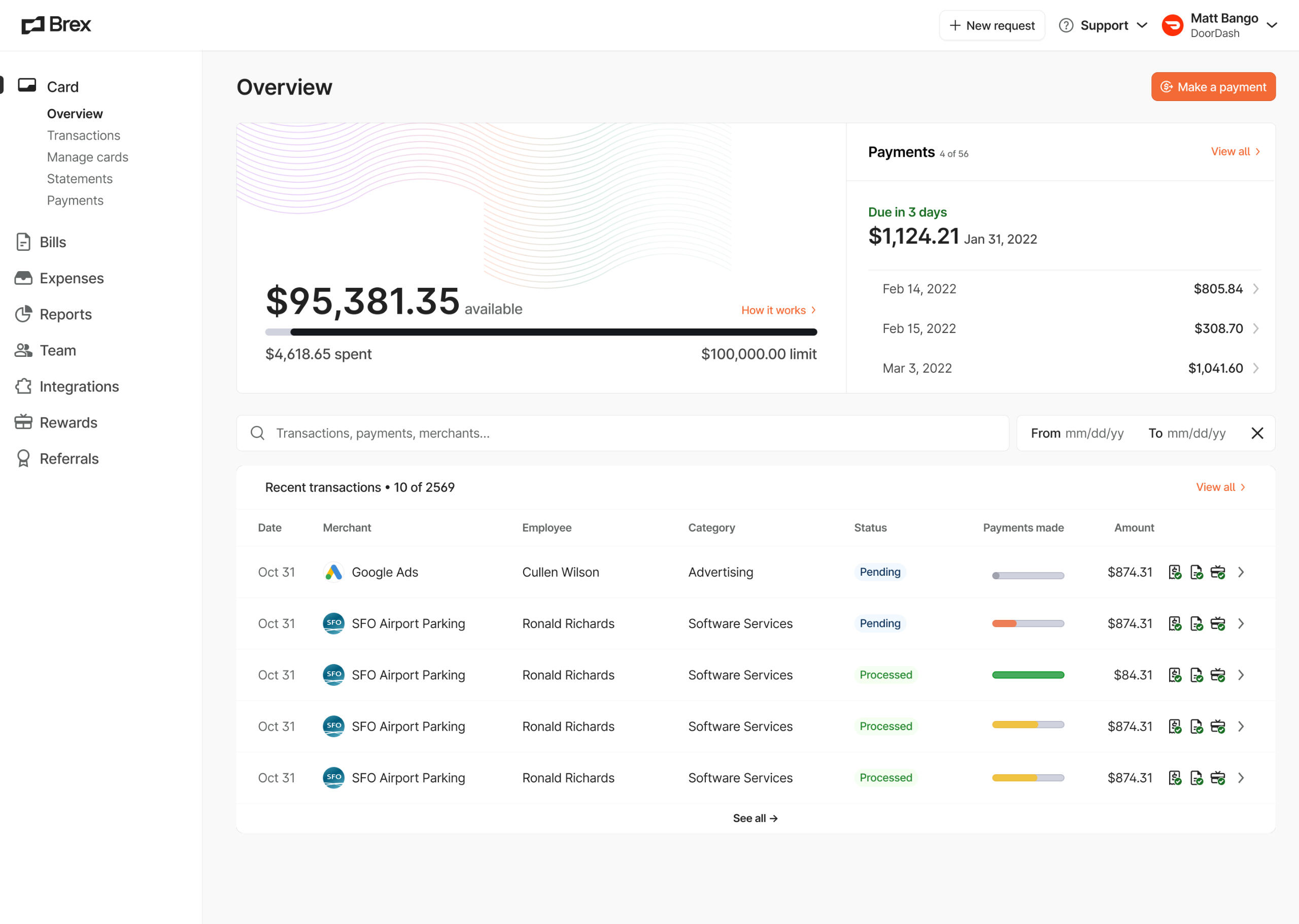
Component and layout explorations
One particular challenge included clearly depicting the summary of upcoming payments — at its most complicated, a Brex admin could see as many as 30 upcoming daily payments. As such, I paid particular focus to the Overview and Payments summary cards, as they presented opportunities to visualize critical information for managing this novel card experience at-a-glance.Because this particular demographic was concerned with making the most of their credit limit, I recommended we invert the card balance visualization from depicting Balance to leading with Available spend instead.
Acquisition & Full time
Designs were presented and approved to Brex design leadership and handed off to the team’s eng lead for implementation. With the MLP complete, the six-week engagement was a success. We began acquisition talks and Studiohouse officially joined Brex.
MLP → GTM
When I came onto the New Verticals team full-time starting in March 2022, I was able to:
Continue design efforts to expand on features we had deprioritized for the initial MVP
Dive deeper into customer research by attending research calls organized by Product
Work with my Product partner and other team leads on feature prioritization and milestone and roadmap planning
Keep xfn teams informed by putting together updated screens and flows in an “experience overview”
Engage xfn Operations and Support teams in long-term planning workshops I designed and led (right)


XFN workshops to inform roadmap planning
With the launch scheduled for July 2022, the product team and I put the finishing touches on the v1.0 product experience. Product and I also kicked off GTM efforts with product marketing and provide feedback on email and website launch materials (left).
Strategy shift & Shutdown
While the team drove towards launch, revenue and product strategies shifted to mid-market/enterprise segments and the organization restructured accordingly. Brex announced an across the board shutdown of all small business segment accounts.After many discussions with leadership if e-commerce would be affected, the BNPL product was shelved one month before the scheduled launch date and the team functions distributed to support the upmarket focus.
"Back in April [2022] we launched Empower, and we decided to put the full weight of Brex towards building the best global payments platform for tech startups and larger companies … but we believe small businesses deserve a partner that is entirely focused on them."
–Pedro, Brex co-CEO
Enterprise Product Experience
Empowering mid-market and enterprise credit and underwriting.
Product strategy ・ XFN operations ・ Product design
Business goal: Acquire higher value upmarket customers and retain successful startups with growing spend management needs.
Design problem: Build a credit and underwriting experience for mid-market and enterprise customers to make better decisions about credit and grow their success.
Outcome: After multiple core product milestones shipped, I researched and led the product vision moving forward.
My scope: I served as the Global Limit group’s design lead and product designer for the Limit Experience product team.
A move upmarket
Starting in Q4 2022, I joined as one of the EPDD leads for Global Limits — the group responsible for the operational relationship, backend tooling and models, and product experience for all credit limit management at Brex. Concurrently to group lead, I also served as the design lead for the Limit Experience product team, altogether supporting a group of over 80 EPDD as the sole design leader.With a larger company focus on upmarket customers and the BNPL shutdown, my underwriting, credit policy, and credit limit management experience gave me an upper hand in building out the product experience for new mid-market and enterprise customers.
Enterprise card application (onboarding)
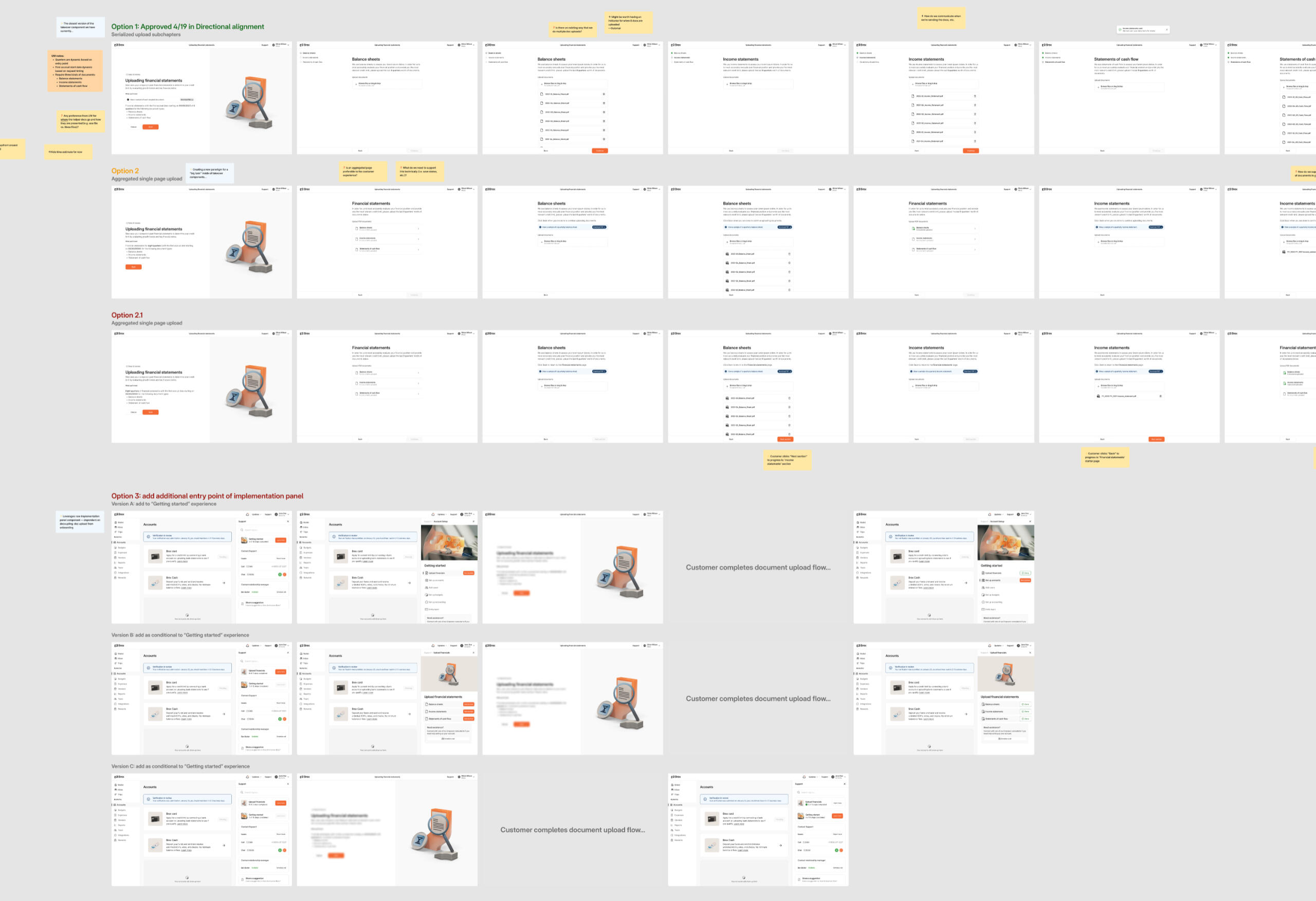
Productizing & Automating
In Q2 2023, our team collaborated with other xfn product teams to support the new company strategy by automating the credit and underwriting requirements for larger customers. The temporary manual processes we had in place were cumbersome for Sales, UW Ops, and Support, hindering our ability to scale quickly.For this significant product update, we collectively decided to sequence updating the Onboarding [M1] phase (credit application and product onboarding) phase with an updated application variant before moving on to the Ongoing [M2] phase (post-approval).


Diagrams I created for documenting the current/ideal states of the underwriting process
An inclusive design process with xfn partners


Selections from the finalized updates to the Enterprise Onboarding flow
For our specific section of the updated flow, I set up standing xfn discussions to keep operational teams actively involved in the design process and ensure consistent and proactive buy-in. My team leads and I worked closely to determine their requirements, keeping them involved in technical and design tradeoffs.By including them closely, we were able to recommend more efficient ways to capture necessary data, and even if we were changing their SOPs, they were well informed of those changes. We were also able to include affordances that preempted customer behavior they'd witnessed while managing the process manually.
Underwriting 101
In my conversations with people outside of the teams directly involved in my group’s product development, I realized that most only had a very cursory understanding of our underwriting approach at Brex. In these "external" alignment efforts, I made sure to orient our group’s work with “Underwriting 101” — distilling our complex and evolving credit policies into simple visuals and frameworks.This opportunity to "evangelize" the importance of credit and UW at Brex would continue on later in my role as group design lead.
"…thanks for that extra context on UW. Admittedly, I didn't really know too much about it beyond the more straightforward way it worked for Startups. 😬 "
–Brex design director


Updates to the Onboarding application could now better set — and exceed! — enterprise customer expectations
Launching Onboarding [M1]
After securing alignment from Design staff, I proceeded to hand off the onboarding changes to the project devs. When the adjacent product teams were ready with their changes, we updated the flow for a small cohort and kept a close eye on the results.The updates performed well and we were able to slowly roll out updates to all customers:
✶ Post launch, the updated Onboarding product experience reduced the total onboarding application time to approval from up to 12 days to an average of 3 business days.
M1 → M2
With the xfn M1 complete, our team quickly shifted our sights to a more internally-focused M2: implementing net new functionality for supporting the Ongoing underwriting needs of existing (or recently approved) mid-market and enterprise customers.I proposed we develop a surface I inherited when joining the team. Rather than the UW Ops team relying on queries for customer lists, manual outreach, and third-party document collection, a customer could be notified and manage their document needs in-product.

Seeking problem alignment on the way forward with an Ongoing underwriting solution
Continuing an inclusive design process with xfn partners
Our team continued with the inclusive design process we had conducted before, now bringing in even more operational stakeholders, namely the Credit policy team and portions of the Sales team.We aligned with stakeholders on the ideal experience, considering technical and operational tradeoffs and handoffs between various operational teams.

In-product Ongoing underwriting experience


Clear and actionable in-product comms across components
In-product comms
With ongoing document requests moving in-product, we could now communicate updates more granularly.
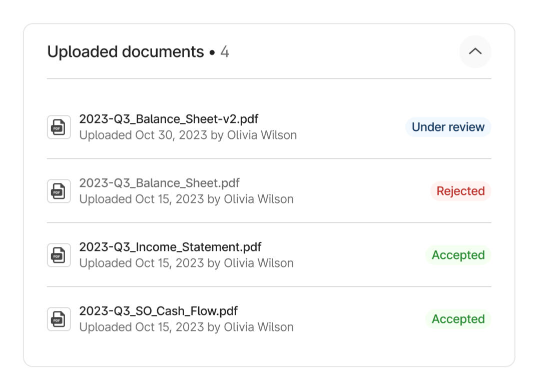
Since a submission could include some incorrect or rejected documents, working with a content designer was critical — even in the most complex states (above), we aimed to make a customer's submission make sense.
Launching Ongoing [M2]
After securing alignment across the board, I handed off the changes to engineering and provided implementation support. We released the product for a small cohort of customers with upcoming Ongoing requests.The updates performed well and we were able to slowly roll out updates to all customers:
✶ In the two months following the initial rollout, about 60% of customers successfully submitted their financial documents with no follow up or manual intervention needed. We also saved UW Ops at least 4 days of work for customer outreach and hours and hours of document review and validation.Importantly, now our high value customers now had a dedicated surface in the product to upload their financial documents and actively manage their credit limit.


Creating the ideal in-product Ongoing experience
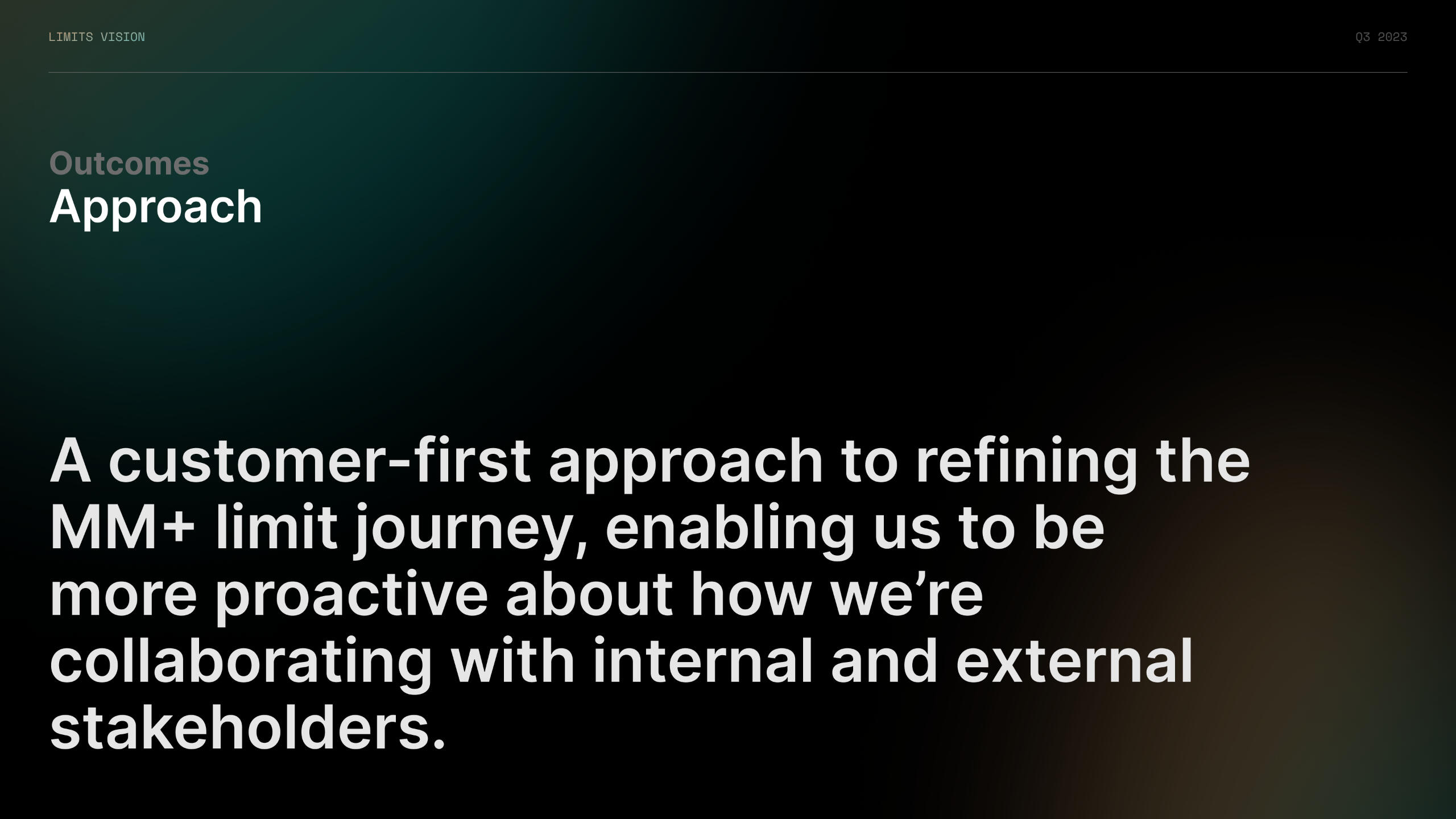
Limits Vision
A product vision for Brex Credit & UW.
Research ・ Product strategy ・ XFN operations
With some major updates live in-product — and building off of the success with a previous vision exercise I drove for our org — in Q3 2023 I began a vision plan to dive deep into more internal xfn pain points and the specifics of our group's problem space for mid-market and enterprise customers.
* To maintain company privacy, some information has been omitted or blurred.
Business goal: Ensure success with mid-market and enterprise customers.
Design problem: Research those customers' credit/underwriting behaviors and needs.
Outcome: A one-year north star vision, multiple customer insights, and themes and opportunities for roadmap planning moving forward.
My scope: I led all research, design, and customer interviews.
A vision for the future
When I started as group design lead, the Limit Experience product team took more of a "firefighting" approach to product development, frequently reacting to one-off requests from Support or feedback from leadership. At Brex, we were well acquainted with Startups, but our group hadn't yet dedicated time to a research effort to learn about our new upmarket demographic.

Lacking a dedicated research function, I wrote, sought feedback on, and finalized a research plan and interview script. I also coordinated and held over 15 customer interviews to gather qualitative research. I focused the conversations around underwriting requirements, credit limit education, and the onboarding and ongoing limit management processes of mid-market and enterprise "limit managers" — a profile I created for the purposes of the study.


Insights, themes, and areas of opportunity
Outcomes
I summarized the findings into three categories of Outcomes: eight insights that challenged our existing product knowledge or assumptions and six themes that I applied to four major areas of opportunity.We used the themes and opportunities for planning and to structure the Limit Experience team’s roadmap moving forward.
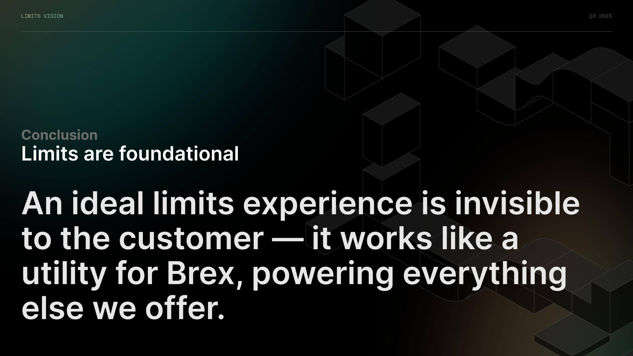
The culmination of this work resulted in a more comprehensive view of the customer credit limit journey for upmarket customers. It also helped our team engage with and more formally incorporate our xfn operational teams into our product development process.In my research's conclusion, I was also able to conceptualize a metaphor for our team and the rest of the company to illustrate how limits fit into our latest product strategy (below).


A more detailed customer journey — now including xfn partners — with related themes
Early Payments 2.0
Higher GMV through a renewed feature adoption.
Growth tactics ・ Product strategy ・ Product design
In H2 2023, an improved customer credit limit experience became a major company focus through inclusion as an explicit company OKR. The Global Limits EPDD group leads strategized on multiple ways that we could reduce the key metric — customer credit limit drops — in our specific domains. If a customer remained in good standing and actively managed their credit limit, they would not be "penalized" with a credit limit drop.
Business goal: Reducing customer card declines and credit limit drops increases GMV without any increase in credit exposure.
Design problem: Experiment with growth tactics.
Outcome: Over a six-week period, one tactic increased feature adoption by over 1,500 customers.
My scope: I served as the sole product designer in a five-person EPD cohort.
Strategizing OKR impact
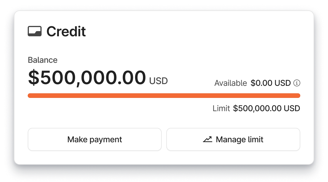
I worked with my group's Product partner to determine if changes to the customer credit limit experience that I oversaw could contribute to the OKR. We realized that our underdeveloped early payments feature (which had been largely untouched since launching in Q4 2022) could be a useful tool to prevent customer credit limit drops.Enabling the feature let customers configure a trigger for automatic one-time payments once they crossed a preset utilization amount — e.g. a customer's balance was paid in full from a preselected bank account when a customer passed 75% of their credit limit.
Our experiment would target customers who routinely hit or exceeded their full credit limit
Although configuring early payments would proactively automate payments for all customers who enabled it, we narrowed our focus to high utilization customers — that is, customers who continually maxed out their monthly credit limit.An initial analysis found that only about 6% of high utilization customers had this feature enabled. Our analysis also concluded that over 80% of customers did not experience a negative change in their credit limit drop after they enrolled in early payments.
Designing the experiment
When H2 began, we brainstormed specific growth tactics with a small EPD cohort (which included an engineer and eng manager and a content designer I led). We hypothesized that if a high utilization customer was continually making manual, one-time payments, they were the best suited for enabling the early payments feature. And that the one-time payments flow itself would be the best to "advertise" the helpful feature.


The existing one-time payment takeover
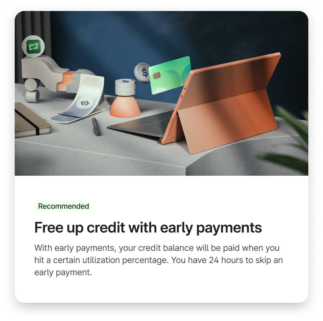
Together, we outlined an experiment for an "early payments upsell" during the one-time payment flow. Although we all wanted the experiment to perform well, I ensured we kept a customer-first approach and didn't introduce anything too noisy or spammy. I began to design it with the content designer I led, making sure to minimize impact on the product experience for fast implementation and iteration.
In our upsell modal, we clearly laid out the value proposition of the early payments feature. I proposed we should lead with as much preconfiguration as possible, which included selecting the same bank account that was just used for the one-time payment. Rather than allowing in-line configuration of the utilization trigger, I had the product engineer find the most common value set for those successfully running the feature.


The experiment added an "early payments" upsell modal to encourage enabling the feature
Launching the experiment
I presented my designs to the team, iterated, and eng built and launched the experiment. Week over week, we reviewed our metrics and revised quickly on the design+eng fronts. And since design and eng was already in there "kicking up dust," we even took the opportunity to improve some low hanging fruit for broader-reaching improvement on the stale feature.✶ Over our six week experiment period we increased early payment feature adoption by over 1,500 accounts.This was a great outcome for the customer credit experience and GMV.
As we got more customer eyes and feedback on early payments in general (and more internal eyes as our experiments performed well), we even laid out two additional milestones in the feature backlog to significantly improve on the general feature experience into 2024

Planned milestones for early payments, including email and UX refinements
Broader performance
In the end, these early payment experiments and other group tactics were able to impact the H2 OKR's key metric:
✶ Limit drops reduced by 44% in Q3, then further decreased by 50% in Q4, smashing our already ambitious H2 goal (15% target) by an impressive 290% attainment.Through the powerful combination of data analysis, growth tactics, and product design, our small team was able to contribute to the company's ambitious business goals and fundamentally improve our customer credit experiences.
∴
Snap × Studiohouse
A new lens on dev tools…and much more.
One of the earliest Studiohouse projects resulted in the opportunity to work closely with Snap on various projects ranging from branding, to web design, to print design.
✶ Projects included:

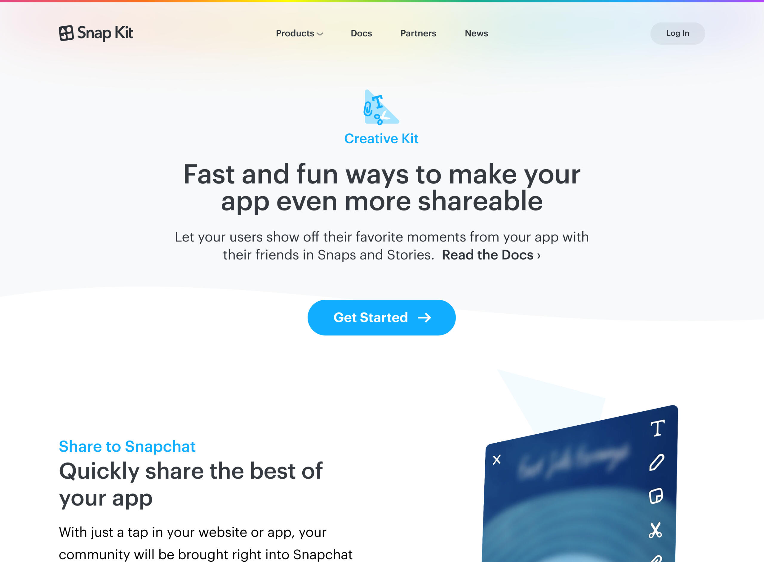
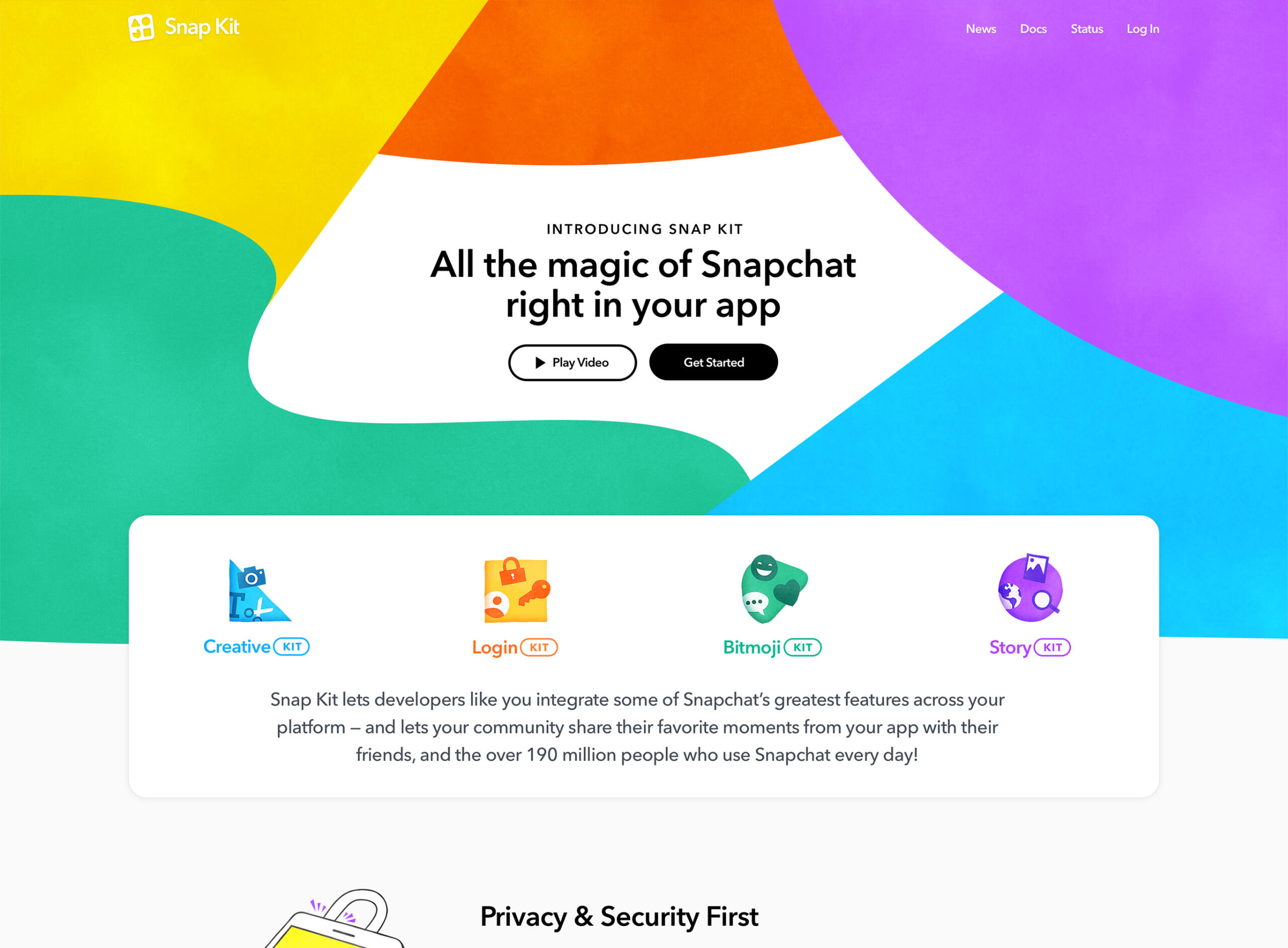
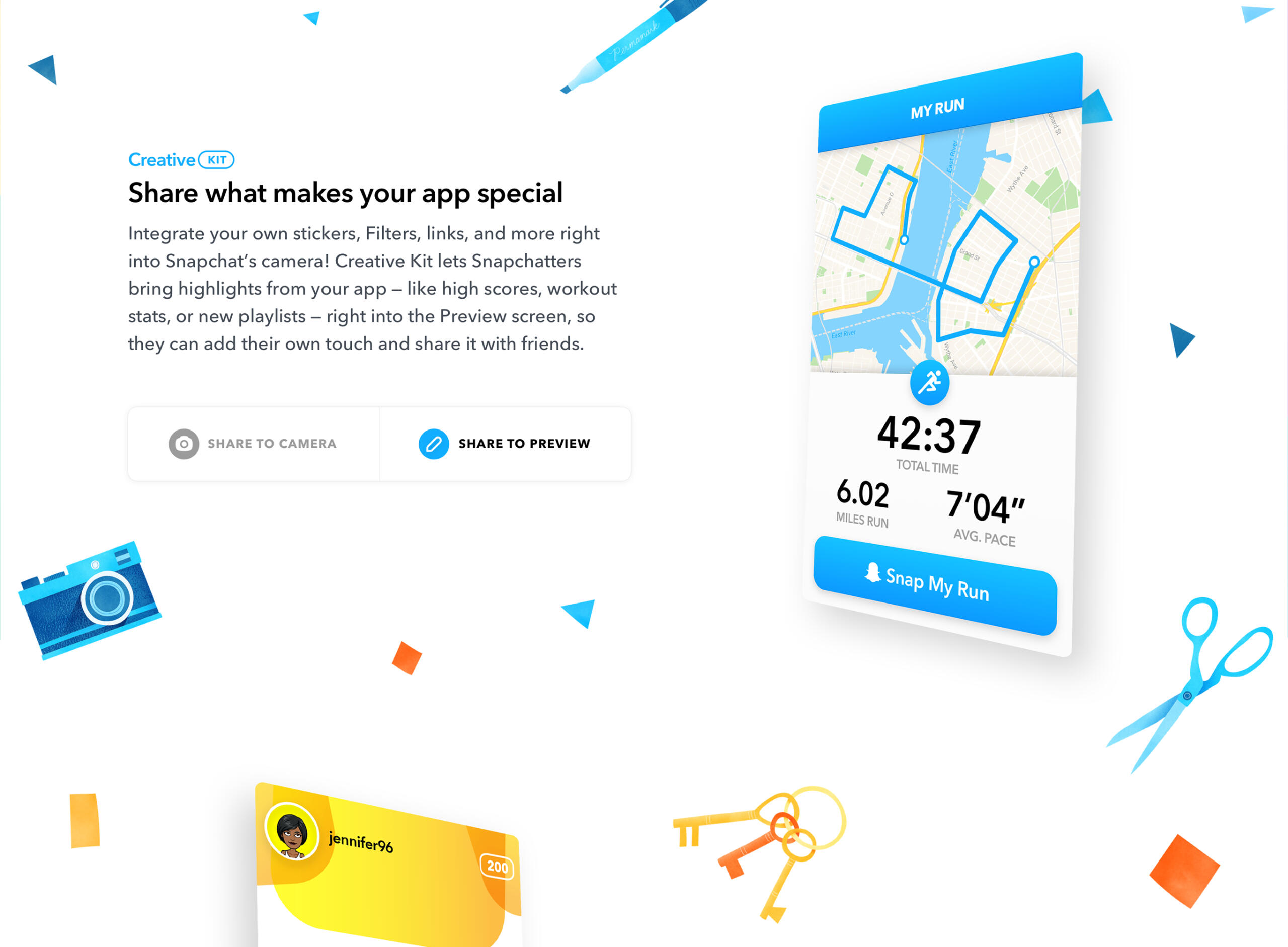
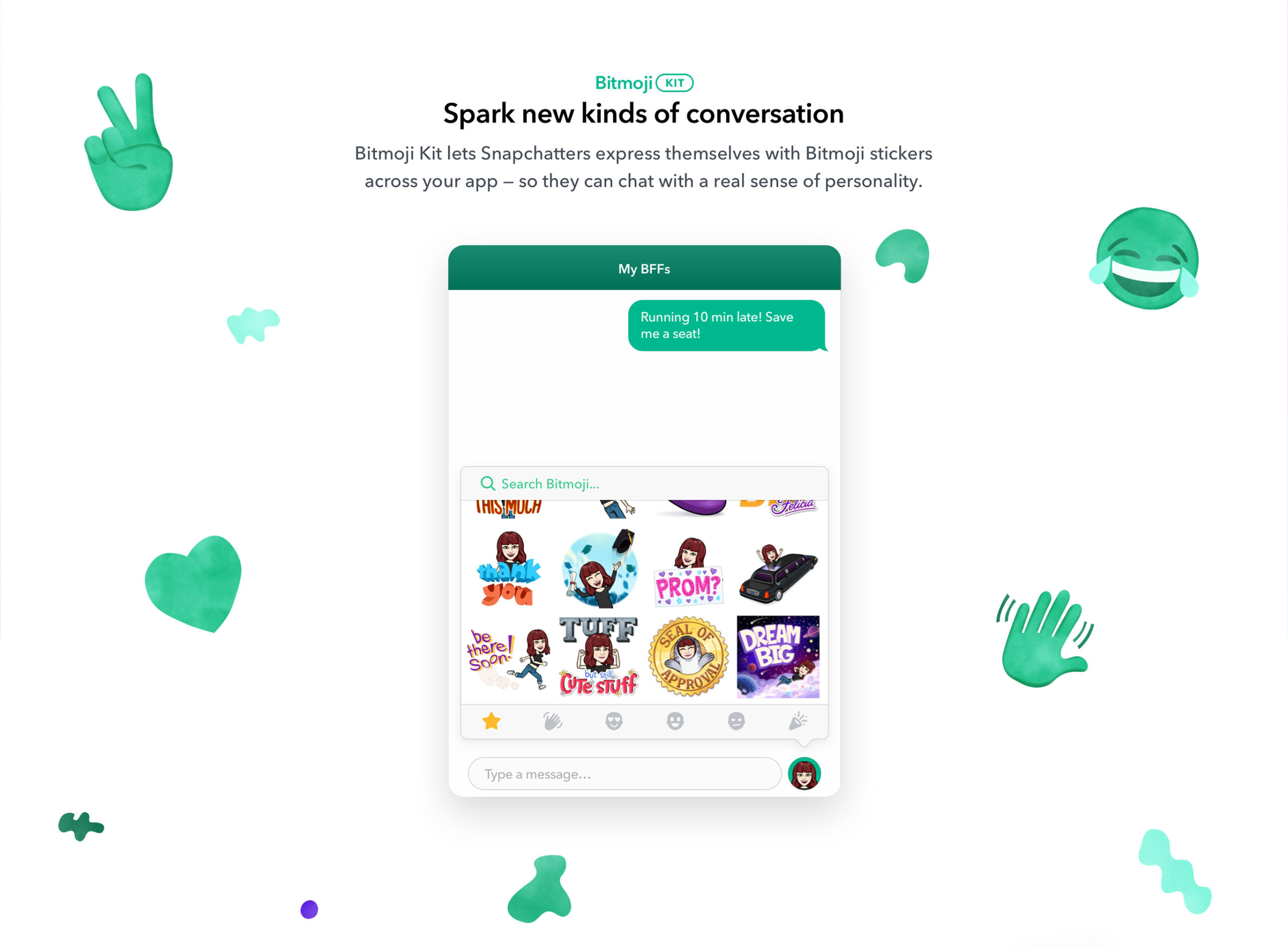
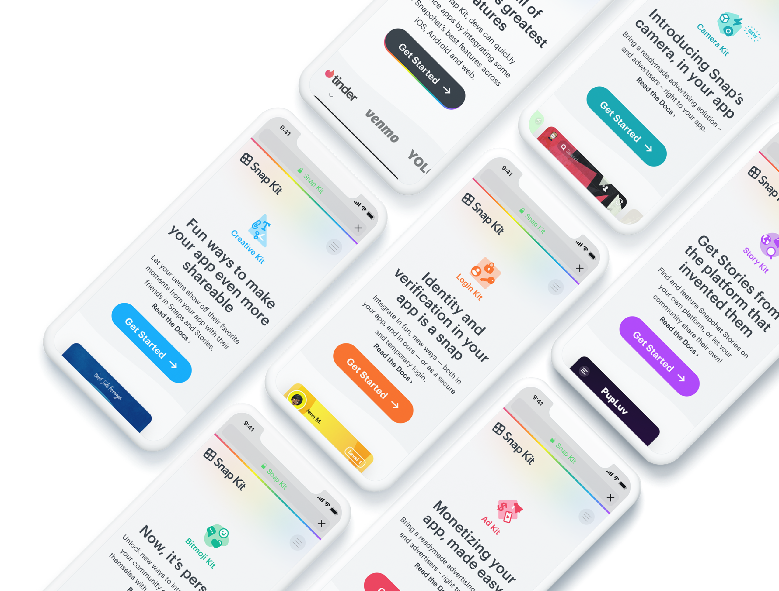
Snap Kit
Launching and evolving Snapchat's first developer platform.
Web design ・ Creative direction ・ Product design
Business goal: Launch a new Snapchat developer platform to leverage integrations for increased app use and ad revenue.
Design problem: "Merchandise" Snap Kit for clear value propositions and concurrent appeal to technical and non-technical decision makers.
Outcome: Successful 1.0 and 2.0 GTM launches, resulting in over 800 partner integrations.
My scope: I served as creative director and co-lead web + product designer.
Soon after we announced we had started Studiohouse, the product lead for a small team of developers contacted us. He mentioned they were finalizing an experimental Snapchat developer platform — and since they weren't provided with design resources, could we partner for a multi-discipline project for their launch?The platform would allow two-way integration with partners. They could either integrate some core Snapchat features into their own apps or websites or easily build off of the existing Snapchat ecosystem made up of nearly 150 million Snapchatters.
A snappy brand
We began with a branding exercise, which I led. We eventually landed on a playful visual concept reminiscent of colorful cut paper, which would play nicely with the parent Snapchat brand (right).The team had trouble deciding between a couple of names for the platform, but I urged them to go with "Snap Kit" as I could foresee the creative potential over a more technical name.The product lead had an illustrator in mind, who we hired. I creative directed him in the "crafty" and "playful" visual style for the pieces we would need. I set the color and iconography of the first four core integrations the team had ready (with two others planned) and called each of these "kits": Creative, Login, Bitmoji, and Story Kit (eventually, Ad and Camera Kit would be added to the assortment in follow up releases).


Snap Kit brand exercise


Kit icons v1.0 and 1.5
To further evoke the "paper" concept and to play into the existing Snapchat brand and visual references, we had the illustrator render additional "snappy bits" — kit-related iconography and visual flourishes we'd use to decorate the platform's marketing site.

More snappy bits
Going along with the "crafty" brand concept and the individual kit iconography, I recalled art supplies I had used in the past and shared the reference with the illustrator. Using the shapes from the kit icons, we came up with the Snap Kit "helix."
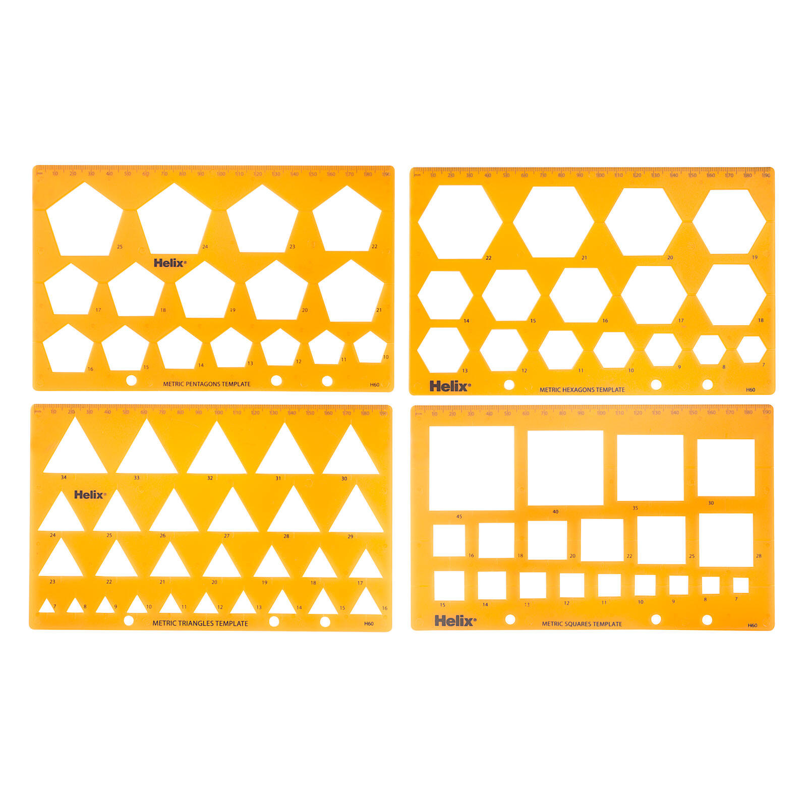
A "Helix" stencil


Snap Kit wordmark in Avenir Pro
So as to not deviate too far from the existing Snapchat brand, we kept the type similar to what was used already in the Snapchat brand guidelines and in the mobile app.
Marketing site
We used the naming concept and visual direction to begin working on wireframes for the marketing site. Since the platform was fairly rudimentary to start, we settled on a single page to communicate all of the features.


Website visual preparation


Understanding Snap Kit
Although developers would be the core audience for the site, we urged the Snap Kit team to also consider non-technical decision makers as their audience.Since anyone visiting the site might not be so familiar with the nuances of Snapchat, we made sure we fully understood the core mobile product and the ins-and-outs of the possibilities of Snap Kit.We proposed inserting single-serving app examples (color coded of course) on the site so visitors could quickly see the benefits of each kit. We designed multiple app concepts and worked with a motion designer to animate each one.
I wrote most of the content on the site as directional placeholders, but after review by Snap's content and legal teams, most of it stayed in place (I was just happy that my favorite line for Story Kit stayed in: "We built stories so you don't have to.") 🎉
One of the Creative Kit sample apps
Snap Kit 1.0
With all of our assets in place and concepts for the site approved, we handed off the site to a small team of developers we hired. We delivered the site to the Snap Kit team, right on time for their announcement at the inaugural Snap Partner Summit.✶ That year, the Snap Kit website helped secure over 200 integrations with partners like Fitbit, Netflix, Tinder, Venmo, and VSCO.The Snap Kit team reached back out when preparing for a v1.5 release, for which we made various site updates.
Details from the Snap Kit 1.0 site


Snap Kit 2.0
When the team was readying for their next major 2.0 release, we were able to evolve the original brand elements and website visual language to be more in line with updated Snapchat brand guidelines.✶ After the launch at the following year's Snap Partner Summit, the Snap Kit 2.0 website enabled the platform to secure more than 800 partner integrations.
📱 Made for mobile
Since we were designing for a mobile app company, mobile was a core consideration when building all versions and elements of the Snap Kit experience. Every snappy bit was perfectly placed and we made sure all the example app videos would perform well on a mobile browser.
Snap Design System 1.0
A project for the Advertising team becomes Snap's first design system.
Design system ・ Web design
Business goal: Outline the benefits of the "Snapchat for Business" advertising program for increased sales.
Design problem: Redesign an existing Snapchat web property while setting a design language baseline.
Outcome: A successful site redesign (and follow-up release) led to the very first version of the Snapchat design system.
My scope: I served as creative director and co-lead designer.
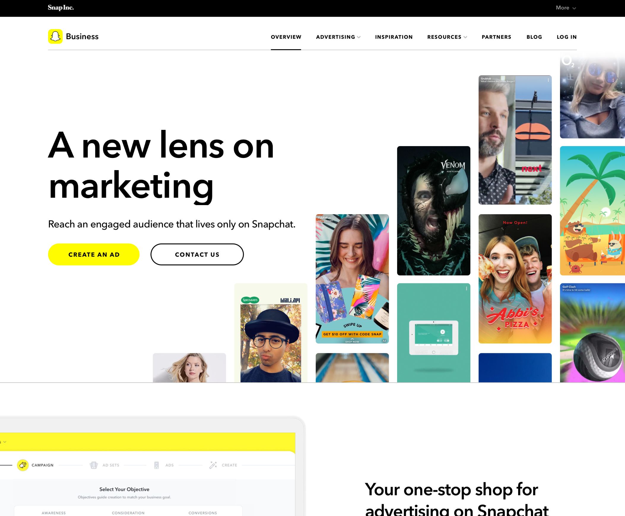
Snap for Business
With multiple successful releases with the Snap Kit team, the Snap for Business team reached out for another web design project.The company had been struggling with siloed-off teams building too many variants of web design visual languages. We agreed with the Snap creative director's request and set one core principle of this project was to attempt to create a baseline for a visual design language that the other web properties could move towards, unified under a "Snap Inc." banner.We designed the advertising site and handed off the materials for the Snapchat web developer team to implement.
We also put together a design system that we delivered to the design team. Based off of the advertising site, this included guidance for grids and breakpoints, a type stack, button and form element styles, and various layouts for heroes and other page template elements.As the team fixed their website variation problem, they would use and evolve from this starting point.

Snap design system v1.0


Snap for Business 2.0
Snap for Business 2.0
After the team found success with our original redesign, they updated the product set they offered to advertisers. They reached back out and we helped them with a content update for the Snap for Business site, adding a product explanation page and a partner showcase.
Snap Inc. corporate work
Helping Snap visualize their diversity and governance efforts.
Print design ・ Data viz ・ Creative direction
Business goal: Report publicly on the company's diversity efforts.
Design problem: Interpret new brand guidelines to create compelling "print" documents; deliver templates for continued yearly use.
Outcome: 2019 and 2020 reports published to Snap's Diversity site, with many template elements still in use through their 2024 report.
2019 Diversity report
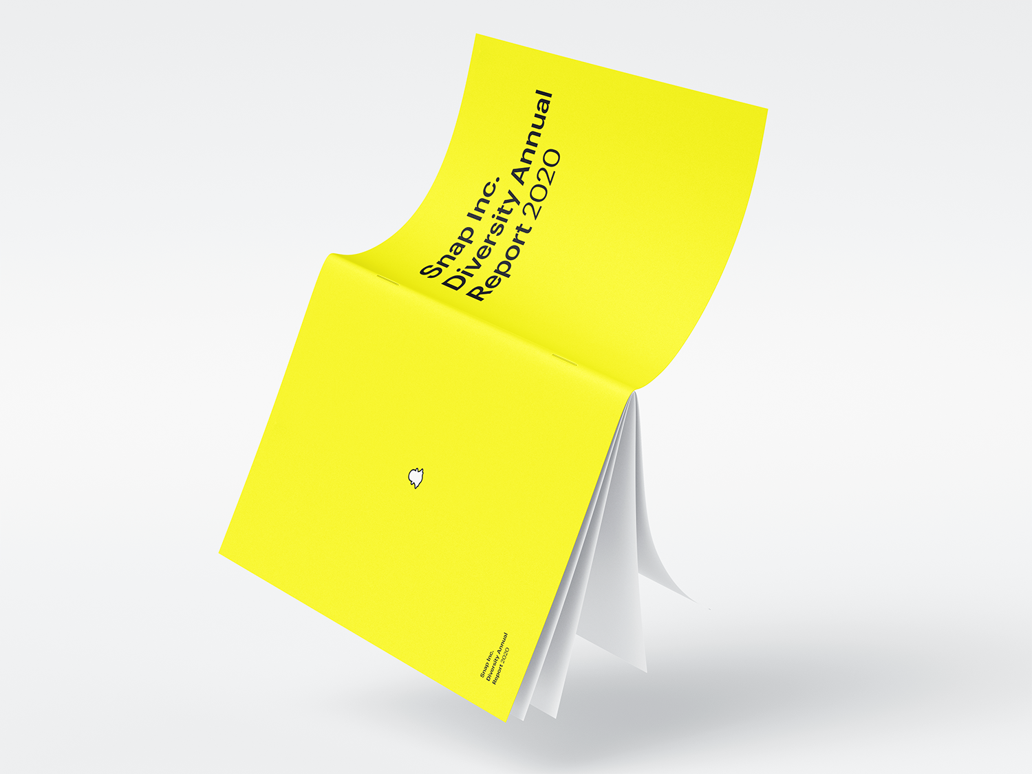
Snap's diversity team reached out to Studiohouse when they needed help designing their 2019 Diversity Annual Report. I was able to interpret the Snapchat design guidelines I had become familiar with in previous projects for a print document. The reports are sent to shareholders every year and published on the Snap Diversity site.For the 2020 report, the new VP of Diversity, Equity, & Inclusion (DEI) was impressed with our work, she asked us back for the following report. I built off of the 2019 template and also tackled multiple data visualizations for the 40 page document (below).


Snap Inc. Diversity Annual Report 2020
CitizenSnap
Another corporate team we collaborated with was CitizenSnap, the corporate governance team. We designed a website for them with the Snap 1.0 design system.Additionally, I creative directed an illustrator we hired to design the team's iconography. Based off of the new brand guidelines' "ghost frame" concept, I led the non-design governance team through the iterations to materialize their four principles: Society, Planet, People, and Governance.These visual icons live on at the (now redesigned) CitizenSnap website.


CitizenSnap "ghost frames"
∴
Glossier × Studiohouse
Getting to play in the gloss.
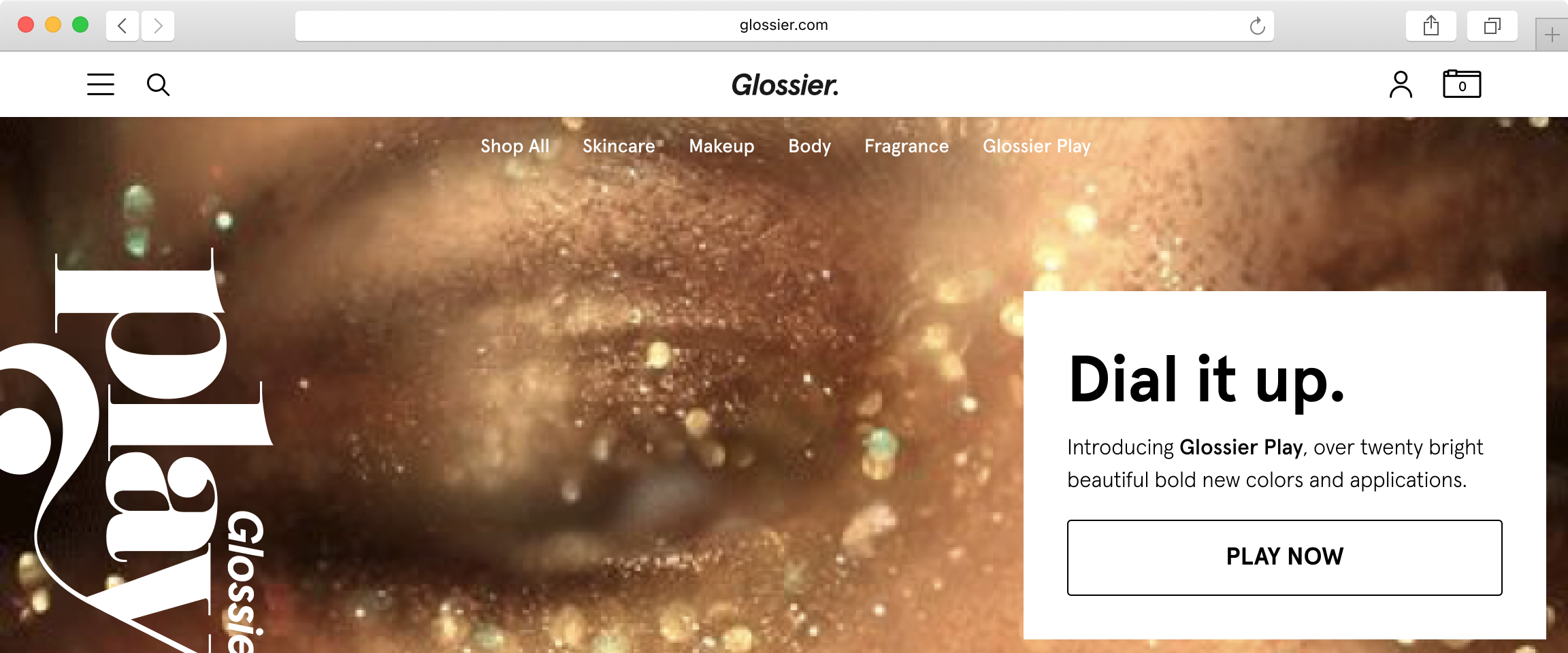
For Glossier, I led the recommendations for an updated brand strategy, which enabled the company to experiment with launches of new sub-brands, e.g. Glossier Play.The new brand strategy included an updated site architecture (which another Studiohouse designer used to deliver a site redesign) — this enabled customers to browse products in more flexible ways and provided the product marketing team ways to cross-sell and up-sell products across inventory.
WorkOS × Studiohouse
Laying a brand's early design foundations.
When founder Michael Gingrich starting early development of WorkOS in 2019, Studiohouse helped him land on a brand strategy and visual identity. Years later, the company has grown beyond just Michael, but the core of the brand still remains.
WorkOS Brand Identity
Visualizing a founder's vision.
Creative direction ・ Web design ・ Presentation design
Business goal: Invest in branding to support pre-product activities.
Problem statement: Align on brand strategy and assets, create teaser website and investor pitch decks.
Outcome: Less than a year after our engagement, the company announced a $4M seed investment.
My scope: I served as creative director and lead web + presentation designer.
Brand design
WorkOS is a platform that enables growing software companies to quickly scale into the enterprise market. Studiohouse worked with its founder to establish a brand identity system that would differentiate from contemporary software companies.Taking inspiration from early computing manuals and corporate materials, I creative directed the brand strategy and brand identity. Ties to these vintage materials helped position the brand as a reliable and long-lasting technical workplace solution.

WorkOS early inspiration
Working with a brand designer, we landed on a logo comprised of an illustrative icon dubbed "The Portal".
"The Portal is a symbolic representation of what WorkOS does. It can be seen as a pathway to a new place or as a conduit between two things."
The wordmark included modern type that anchored the company and its products in the presentfuture.


WorkOS brand identity


WorkOS brand guidelines
Other brand elements, like secondary type and colors referenced the vintage look and feel of the original mid-century inspiration points. I even came across inspiration for colors in-person at The Guggenheim.
More color inspiration from Hilma af Klint's The Parsifal Series (1916)
Additional touchpoints
To showcase the viability of the brand identity, we provided speculative brand treatments like business cards and posters (a callback to our IBM inspirations).Additionally, given my background with startups and fundraising and M&A conversations, I provided a scalable template for use during seed funding conversations with VCs.


WorkOS brand treatments
Current WorkOS branding
Foundations
Although the WorkOS company and product has evolved years later, the design team has maintained the original foundations of the brand identity we delivered.
∴
Verishop × Studiohouse
Putting a new demographic in the mood to shop.
Studiohouse worked with a small product team at Verishop to concept an experimental mobile app shopping experience targeted at a younger demographic for the e-commerce retailer. We came up with a mood ring style app where various "moods" would lead a customer to a showcase of curated clothing, accessories, and other merchandise.Since the concept enabled the merchandising team to liquidate excess inventory, a "shop your mood" module and browsing entry point was added to the company's e-commerce site.
General Motors
The future of transportation from America's biggest automaker.
Following the GM acquisition, the Sidecar team's main initiative would be to support Maven, a carsharing pilot that GM had been testing both as residential and public carsharing (like Zipcar) in markets like New York and Ann Arbor, respectively.
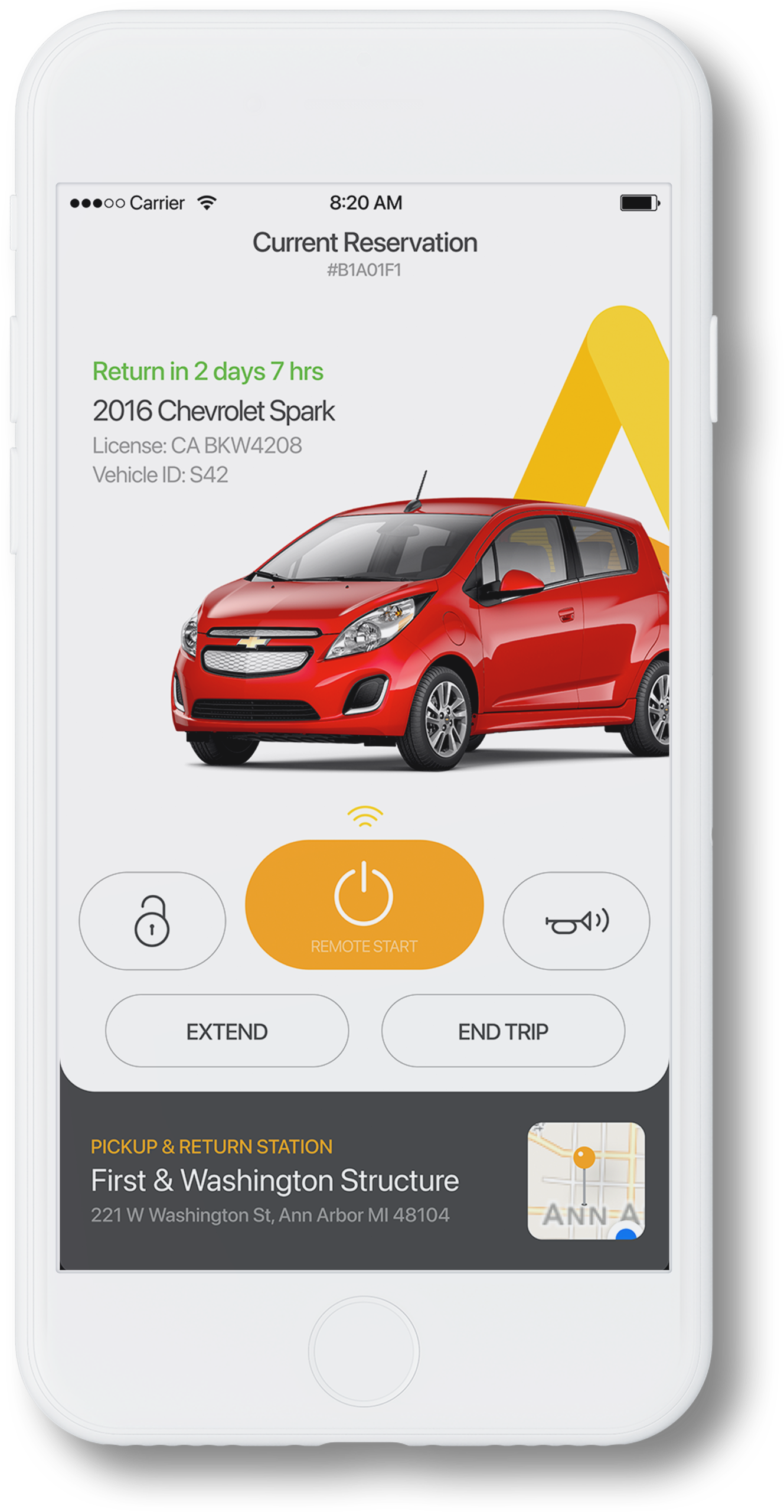
Maven app + Brand Refresh
GM does carsharing.
Product design ・ Service design ・ Creative direction
Business goal: Leverage GM resources (vehicle inventory, OnStar and in-car panel access, brand affinity) to launch a carsharing program.
Problem statement: Redesign the Maven mobile app to create a world class carsharing product experience.
Outcome: Completed a full redesign of the Maven mobile app experience, including merging two disjointed Maven apps.
My scope: I served lead product designer, overseeing and coordinating a team of five distributed product and UX designers.
A design challenge
As Chief Creative, my experience owning the design of Sidecar's mobile apps and brand identity served me well. Though the Maven pilots had been in operation for some time, there were two separate mobile apps for residential and public carsharing with clunky interfaces and separate visual design languages.I organized an in-person workshop at the old Sidecar office to kick off the project with the designers across SF, Austin, and Detroit.


GM+Sidecar design sprints


Maven 2.0 visual design/layout explorations
I worked closely with the PM out of Detroit to conduct site visits for the residential carsharing facilities and led the charge with him on determining how we could ensure the product experience could seamlessly serve the needs for both residential and public carsharing.I diagramed the experience through multiple iterations (left) and began to wireframe the end-to-end screens we would need to design.
Once we landed on a suitable solution (cleverly using the signup promo code field during registration to fork an onboarding variant for residential carsharing), I began to explore visual designs for the mobile app experience.Since GM was providing the inventory of cars, I was able to showcase the high resolution vehicle imagery in the app experience.

Maven 2.0 flow diagrams and interaction design prototypes
Previous Maven brand and app
Identity refresh
Since the pilot had been running for a couple of years, GM had been using a brand identity that was quickly commissioned at the start of the pilot (without much investment into the outcome).While I was redesigning the app, I led the communication designer I had originally hired for Sidecar through a brand identity exercise. We kept the yellow, but ensured it was easier to use and see on a mobile screen, and notably updated the type to a more modern (urban) and human type.
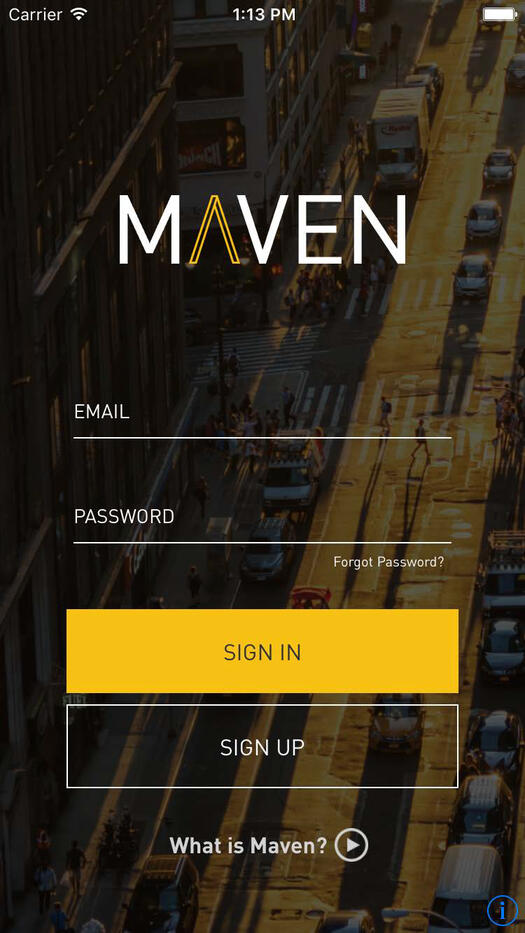

Maven brand refresh
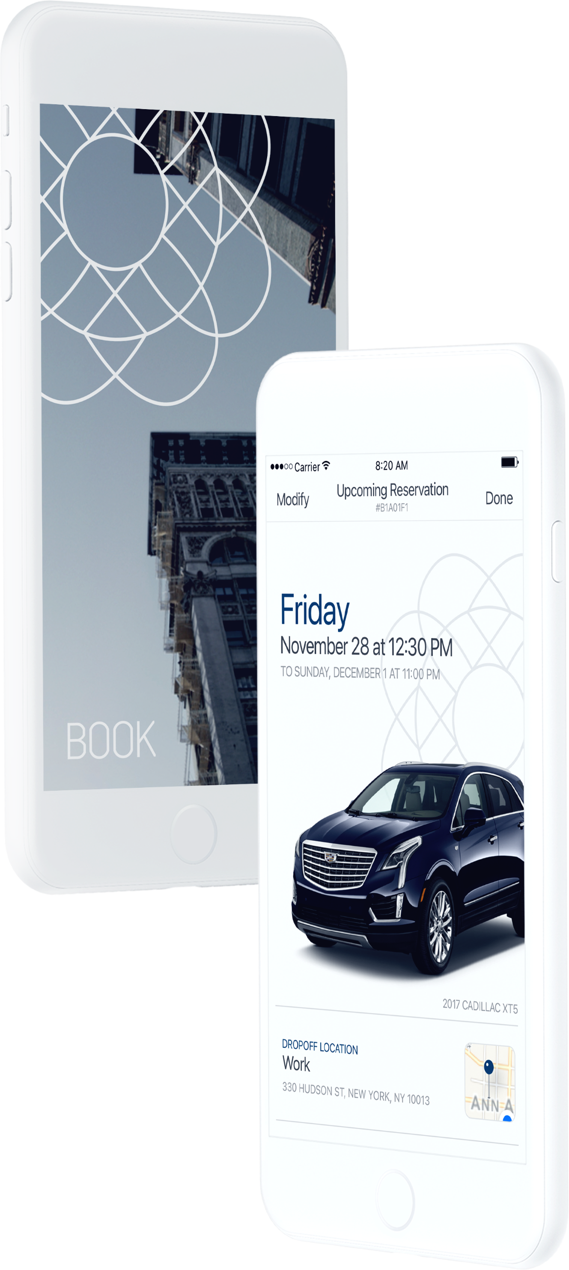
I finished out the visual design for the end-to-end experience, including multiple onboarding and registration flows, a full reservation flow, and car controls (right).The design team began to use the updated type, colors, and app components in their various feature updates, creating the initial design system. Additionally, custom iconography from the brand exercise was incorporated into the design system.


Some key screens from the Maven 2.0 mobile app
Scalable design
As internal council for other GM “urban mobility” programs (including the Cruise/Lyft autonomous vehicle joint venture), I was also able to consult with the New York based team of BOOK by Cadillac, a luxury carsharing service.This included ensuring Maven's design system could be repurposed for any similar reservation functionality (right).

Scaling the Maven design system to BOOK by Cadillac
∴
Sidecar
Ridesharing created for and powered by everyday people.
Sidecar was the world’s first peer-to-peer ridesharing network and was acquired by General Motors in 2016.As Sidecar's Head of Design, I was responsible for all of the company's design properties, including a Rider app, a Driver app (both available on iOS and Android), and the company website. I also owned the brand identity, which I creative directed through a brand refresh.
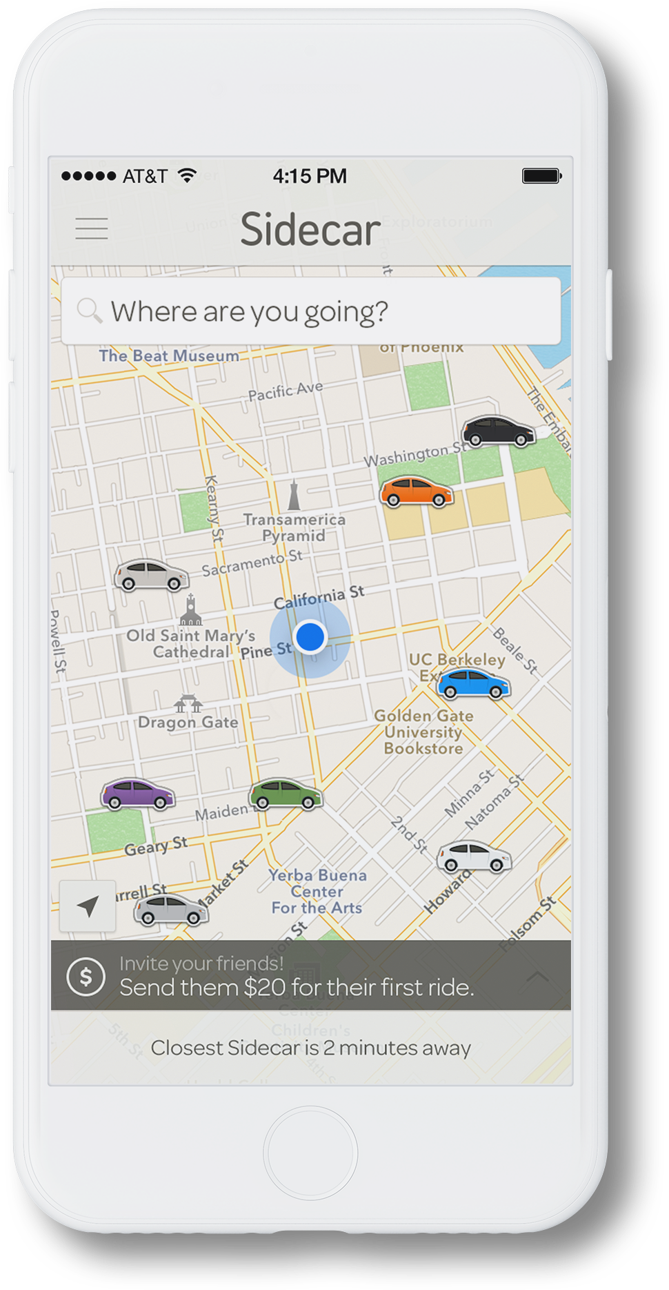
As the company’s first design leader, I drove the complete overhaul of all design assets — including mobile apps for Riders and Drivers (both available on iOS and Android) and the company website — establishing a multi-platform design system.Additionally, I established the team structure and sourced, hired, and managed a design team of four (two product designers, one communication designer, and one content designer) while still remaining hands-on.


Product design
The Sidecar Android and iOS apps were used by riders to locate, message and pay drivers for rides — a corresponding app for drivers was also available.


Side.cr website
The Sidecar website showcased the service’s features and allowed drivers to apply to drive.
Brand identity
In 2013, the service received traction among competing ridesharing services.A brand refresh portrayed the company as a more approachable and human alternative to competitors. Modified colors, new typography, and iconography in updated apps and marketing materials presented a modernized look and feel.
∴